Helping Students Go Further with Their Data Analysis
By jmueller-northcott on April 27, 2016
“The data shows that my hypothesis was wrong.”
Oh no. What happened? My high school students were working on the Ocean Tracks College Edition draft module, “What’s UP with the California Coast?” and this was one of my group’s final claim. They had been confronted by a few data points that didn’t fit their initial prediction of where and when they thought Bluefin tuna would be found and now they were ready to throw out their hypothesis. In this blog entry, I want to share some of the steps I took to coach students away from viewing their hypothesis as right or wrong and help them think more carefully about the data as they came to their final conclusions. 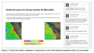
As my students finished up, “What’s UP with the California Coast?” I was concerned that students were a bit too rushed as they worked on their data analysis in the last part of the module. One of the most unique aspects of the Ocean Tracks interface, is that it presents students with such a variety of different types of data. Students can track different marine life and use measurements from maps of oceanographic features. But the variety and authenticity of the data increases the complexity of the task of its analysis. The data skills, such as describing data patterns and selecting appropriate data for addressing the guiding question, are what I want to emphasize the most as students use Ocean Tracks. But as students finished up this module, I was struck by the fact that I hadn’t given students enough time to do the most important work. These suspicions were confirmed when I went to look at the work they had generated. Students had been thorough with their background research and did a fantastic job collecting their measurements using the Ocean Tracks interface. But their answers to the conclusion questions I had given them, were a bit lacking. Students seemed willing to either agree that their hypothesis was supported and chose one piece of data to support that idea or to conclude that their hypothesis was incorrect.
The data itself is quite a bit more nuanced than the students were admitting. The track of the Bluefin tuna didn’t always behave the way students had predicted. It seemed as those the students didn’t notice this or were choosing to ignore those data points in favor of the data that did fit the way they had expected. They had oversimplified what the data had meant and were quick to form their conclusions.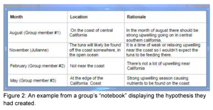
Viewing their responses made me realize that I had skipped over a key part in this lesson. I had worked with them step by step when it came to doing the background research and collecting their measurements. But when it came to the analysis of the data points and making some decisions about their final claims, I had let the students work independently. In retrospect, I realized that I missed out on the opportunity to guide them when they needed it the most.
It’s important that we do more than just ask students to analyze the data. We need to give them the tools they need in order to do this well. After watching my students have a successful start to this module, but then see them ultimately stumble, I was left with many questions. How can I better coach students to analyze their data? What prompts can I provide that ask them to compare their numbers and really think about how those measurements match up to their predictions? How can I help students wrestle with what it means when the data doesn’t totally fit their expectation?
I was feeling a bit unsettled about my students’ work and at the next break in the curriculum I made a conscious decision to revisit the Ocean Tracks module and to try the data analysis piece again. I treated the work they had done already as a rough draft. Using Google Slides, I was able to comment on their slides and give them specific feedback on the work they had done so far (see an example of this kind of feedback in Figure 1). But in addition to responding to those specific suggestions, I wanted students to think about the data they had gathered with a broader perspective. To help with this, I generated a lesson plan that took students “offline” in order to reflect on and discuss the meaning of their data.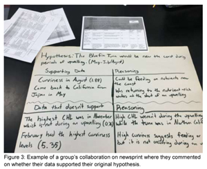
I printed out each group's measurement table and gave each group a piece of newsprint. I asked the students to look at the data they had gathered again and categorize it: which data supports your hypothesis and which doesn’t support their hypothesis? On the newsprint I had them make a two column table for their evidence and their reasoning for why each piece of data supports or doesn’t support that hypothesis. We then hit our first stumbling block. Students couldn’t remember what their hypothesis was or where to find it! I had to remind them again of the predictions that they had made earlier in the module. (See Figure 2 for an example of student work showing the predictions that students had made previously). Groups then took a moment to re-work their hypothesis and write it as a statement; a format that they were more familiar with. For example, “In the summer the Bluefin tuna are more likely to be near the coast because of upwelling, whereas in the winter they are less likely to be near the coast.” Next, students had to pause and consider the data more closely than they had on the first attempt. At first they asked questions like, “Well, how do we know if the data supports our hypothesis?” We took a moment to review the clues that would indicate feeding behavior of the tuna. As a class we discussed how the curviness of the track can indicate a feeding behavior and also talked about what we would expect to see in the levels of chlorophyll in a productive area. Now, students were ready to get to work. As you can see in Figures 3 and 4, students were able to organize their evidence and explain why the data either fit or didn’t fit their expectations.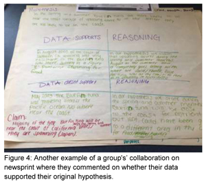
What I liked about the newsprint activity was that it fostered collaboration and discussion between the group members as they contemplated the data. Before a piece of data was categorized as supporting or not-supporting, the group had to discuss it and make sure they were in agreement prior to writing it down on the poster. Also, by having the two categories, it made it ok that some data didn’t support their initial hypothesis. I had given them permission to be surprised by the data that was unexpected instead of just trying to ignore those data points that didn’t fit their expectations or say that their entire hypothesis was incorrect. I asked students, “You’re the scientist trying to learn more about tuna behavior, just because one tuna didn’t do what you expected, does it mean all of your research you have done up until this point is wrong?” They were able to say, “No, but we would need more information. It would be good to look at more tuna tracks or look at data from different years.” Yes! This is what I was hoping to get from the students. They were starting to look at the data more critically and realizing that sometimes the data analysis process can yield more questions and illustrate a need for additional data collection.
But there was still one element of the tuna’s track that was puzzling to students. Students were confused about the tuna’s behavior in May 2003. During this time, students had observed that in the chlorophyll (CHL) map overlay there was a nice upwelling off of central California and students were perplexed why the tuna was way out in the Pacific when it could be enjoying a feeding frenzy off of the coast. (See Figure 5 for an example of a student’s screenshot of the tuna track in May of 2003). This took a little bit of prompting on my end to help students try to puzzle this out. We had to go back to the beginning when we did our first Ocean Tracks module and talk about the reasons why an animal might migrate. I asked students, “Is food the only motivating factor for an animal to migrate?” This was the hint that they needed and students were quick to say, “Oh, the tuna is looking for a mate!” and “They are going there to have their babies!” Now they were on the right track! But they needed a little help clarifying their misconception that tuna mate and I once again pointed them in the direction of the Ocean Tracks library to fill in their gaps.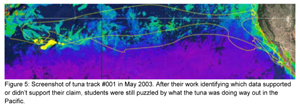
Now, students were ready to make some conclusions. I was happy now that students had the opportunity to be more thoughtful when contemplating their data. They had carefully considered each data point and had discussed it with their peers. We had taken the time in class for students to share their newsprint posters with each other, commenting on the similarities and the differences between posters. Students were able to move beyond, “Yes, my hypothesis was correct” or “My hypothesis was wrong.” They were able to now consider an alternative position like this example of a group’s claim, “Although primary productivity is a factor, it is not the only factor that moves the tuna around the ocean.”
My students had come a long way in understanding what to do when confronted with data that doesn’t behave in the way you had expected. When working with an authentic data set such as the data presented in Ocean Tracks, students are presented with the opportunity to wrestle with such data. One of the unique features of having students work with this kind of data, is that it looks a lot different than the data that they are used to working with in their high school science classes. Students are used to working with either data they have generated themselves through lab work or data that has been collected by someone else and that has been “cleaned up” so that students can more easily see patterns. When students collect data through lab work, this is usually a very small data set which has been collected in a way to give them the most accurate results possible. In these situations, the data usually clearly supports their hypothesis and they have to discuss those few data points that they gathered to help them make their final conclusions. When students are given data in a table or graph that has been selected by me as their teacher because it shows a clear trend or pattern, the objective is for students to use those more obvious data points to explain a particular pattern. Both of these scenarios are useful exercises for helping students better understand science content and helping them with the skill of supporting claims with evidence. But what about the real-world skill of understanding that a complex data set that might behavior in an unexpected way? What I love about using Ocean Tracks is that not only are students working with real data, but it also presents a more authentic task for them as well. It pushed their data analysis to the next level and asked them to think like a scientist would. What would a scientist do if confronted with data that didn’t match their expectations? What would the next steps be? The work that my students did on this module helped them learn that science isn’t always black and white; that sometimes there is a lot of interpretation that needs to be done before a clear pattern can be recognized. The Ocean Tracks interface and curriculum presents a unique opportunity for students to practice this real-world, scientific skill, which they can employ in future settings.
Grade Level:
Audience:
- jmueller-northcott's blog
- Log in to post comments
About the Author
 Julianne served on the Advisory Board for the Oceans of Data project, which produced Visualizing Oceans of Data: Educational Interface Design, and has worked for ODI from early conceptualization of Ocean Tracks to the present, developing curriculum modules for both high school and college students. She teaches biology at Souhegan High School in Amherst, NH, and has been using Ocean Tracks to teach concepts in ecology and marine biology and to develop her students’ skills in working with complex, authentic scientific data sets for four years.
Recent Posts
Kirsten Smayda
Posted: 10/07/2021 - 09:45
Author: Randy Kochevar
Posted: 02/24/2021 - 11:29
Author: Libby Boghossian
Posted: 02/04/2019 - 10:39
Author: Randy Kochevar
Posted: 03/05/2018 - 16:28
Author: Randy Kochevar
Posted: 02/13/2018 - 20:56
- 1 of 7
- next ›