Data Visualization — A Matter of Perception
By rkrumhansl on September 13, 2016
What an expert sees in a data visualization is not what a novice sees. This is an important lesson learned from a two-year project undertaken by the Oceans of Data Institute, funded by the National Science Foundation.
Our visual system doesn’t operate like a camera, capturing pictures in our memory. Rather, visual perception is better described as information processing—a sophisticated system of sorting through, filtering, and greatly reducing the large quantity of sensory input that continuously bombards our eyes.
The filtering begins early in the perception process, and we actually only “notice” a small portion of what’s in our environment. For example, we’re only able to perceive fine details in the center of our visual field, where the fovea—an area of the retina with closely-packed cone receptors—can detect color and other visual features with greater acuity. We have the illusion of a full view because we sample what is in our peripheral vision with rapid eye movements. And we sample only what catches our attention. So that means we miss a lot.
Figure 1 is a simplified description of the information processing that is conducted during visual perception. Much of it is automatic and does not require conscious effort on our part—lightwaves strike our retina, and we register certain fundamental properties of the objects and events in our surroundings—for example, differences in light level, wave-length, and spatial position. From this, we construct a “rough sketch”, and begin to use our conscious, short-term memory to map what we’ve perceived to what we already know—identifying key features and interpreting and extracting meaning. Through this process, we modify and build new knowledge, or “schemas”, which are stored in our long-term memory. This is key to why experts and novices see the world so differently.
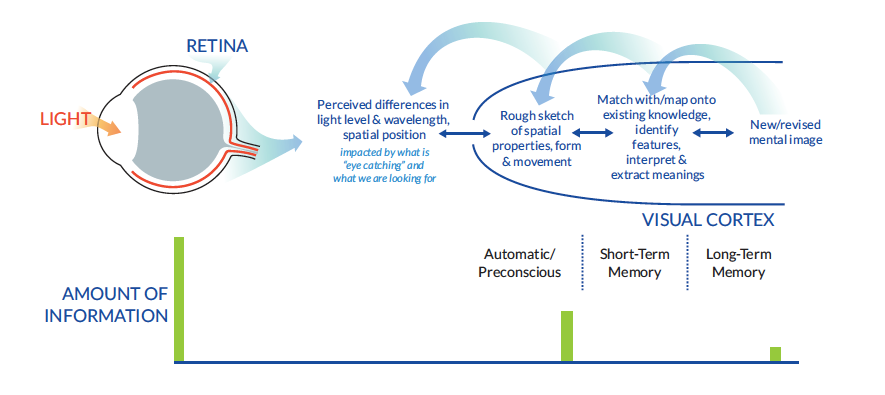
Figure 1. From the Visualizing Oceans of Data: Educational Interface Design guide.
Our short-term memory is a critical bottleneck—it’s basically what we’re able to hold in our attention at any particular time. Long-term memory, on the other hand, is virtually unlimited in capacity. Over time, experts build sophisticated schemas in their long-term memory that allow them to quickly recognize aspects of their visual environment. This frees up valuable space in their limited short term memory to attend to and process additional information.
So, for example, when looking at the data visualization in Figure 2, some will spend their short-term memory resources recognizing that this is a map, trying to figure out whether the colored part represents land or ocean, and trying to orient themselves to the scale and coastal outline. Others, who work with this kind of visualization all the time, will instead be using their precious short-term memory resources to recognize patterns in the flow of the Gulf Stream, and perhaps compare the flow to mental images of maps from other seasons that they’ve seen before.
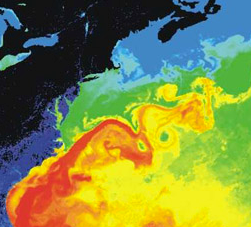
Figure 2. From: https://commons.wikimedia.org/wiki/File:Golfstrom.jpg
We undertook our study because we wanted to understand how to design data interfaces and visualizations that were student-friendly. Recognizing that we can’t change the overall amount of information we can work with in our short-term memory, but we can change the types of things we are engaged with, the guidelines we developed emphasize the importance of minimizing visually distracting and confusing aspects of data representations that might unnecessarily consume the students’ attention.
For example, we learned a lot about common issues with the use of color in maps. I generated all of the images in the figure below on the NASA GIOVANNI data portal, which we were attempting to teach high school teachers and their students to use. All of these maps show exactly the same sea surface temperature data, just applying different color pallet options to the display (by the way, each pallet has a name designed to be interesting/ appealing to users – guess which one is called “beach”?).
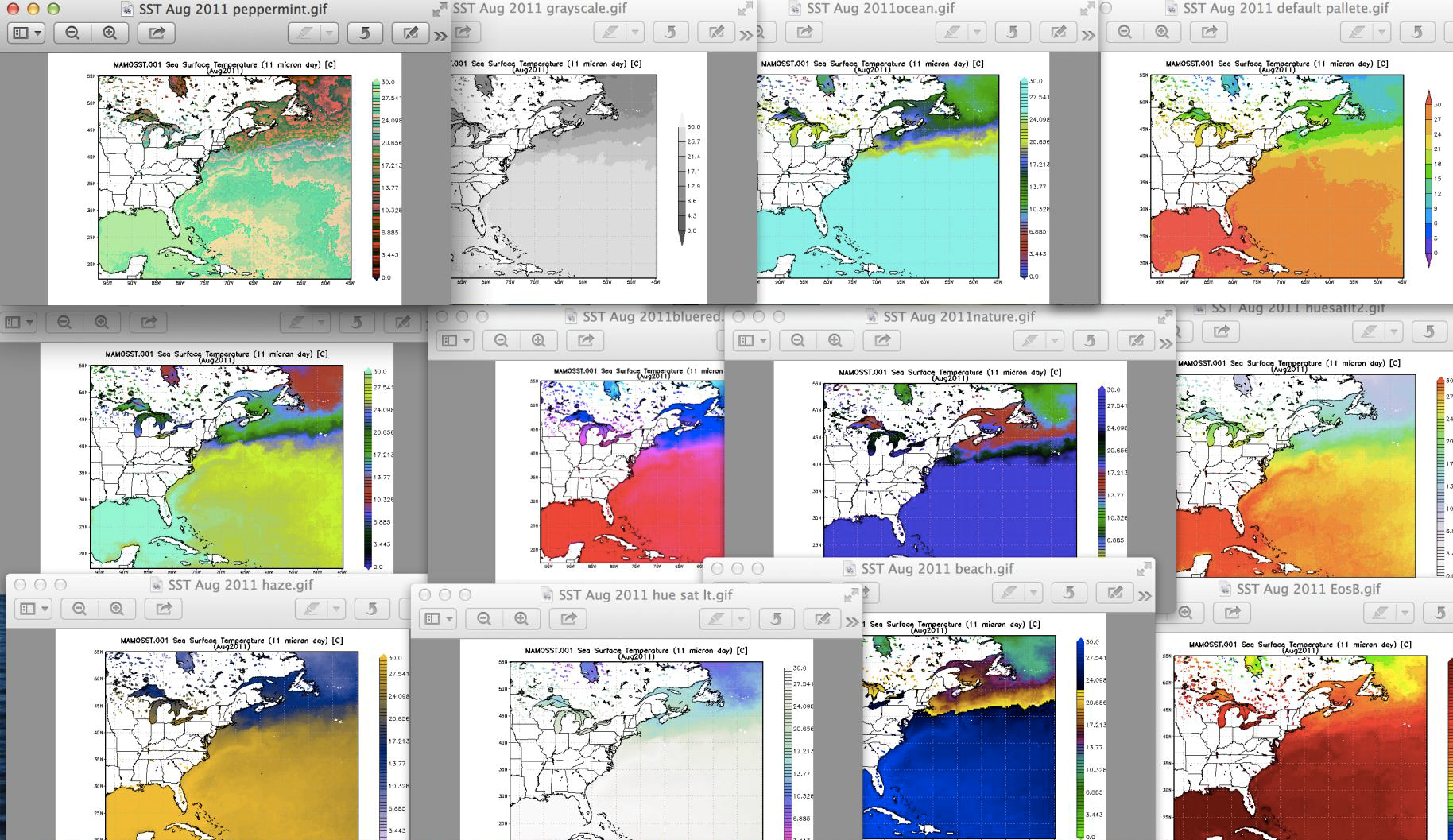
Figure 3. Gathered through the NASA GIOVANNI data portal.
An expert would be able to quickly decide which pallet to use to highlight physical oceanographic features. Novices, on the other hand, would need considerable support deciding which one to use, and how to recognize meaningful patterns in these displays. If presented with a map with a misleading color pallet, they might draw wrong conclusions from the display.
So next time you look at a weather map, think about the colors that are used and how they affect your interpretation of the display. And if you’re designing data portals or data displays for students, see our guidelines in Visualizing Oceans of Data: Educational Interface Design.
Grade Level:
- rkrumhansl's blog
- Log in to post comments
 Ruth is the Founder of EDC’s Oceans of Data Institute. She is the principal investigator of the NSF-funded Oceans of Data and Ocean Tracks projects, and lead author of EDC Earth Science. Before joining EDC, Ruth was a high school science teacher, a chief scientist in environmental consulting, and a petroleum exploration geologist.
Recent Posts
Author: Emma Perry
Posted: 07/17/2017 - 13:28
Author: Linda Fergusson-Kolmes
Posted: 07/06/2017 - 11:48
Author: Leana Nordstrom
Posted: 05/18/2017 - 17:21
Author: Randy Kochevar
Posted: 04/19/2017 - 16:15
Author: Patrick McDeed
Posted: 03/15/2017 - 14:48
- ‹ previous
- 2 of 7
- next ›